Microsoft is taking over the appearance of the active Windows 10 tiles. It s fast
More than seven years after the release of Windows 8, Microsoft reportedly began to contemplate the thought that giving application developers complete freedom in choosing backgrounds for active tiles may not have been the most wonderful of ideas.
Microsoft, as it confesses in the last webcast for Windows beta-testers ( here link , scroll to 47. minute) is currently looking for a new design for active tiles in Windows 10. The problem identified by Microsoft is basically a bit random background for each tile.
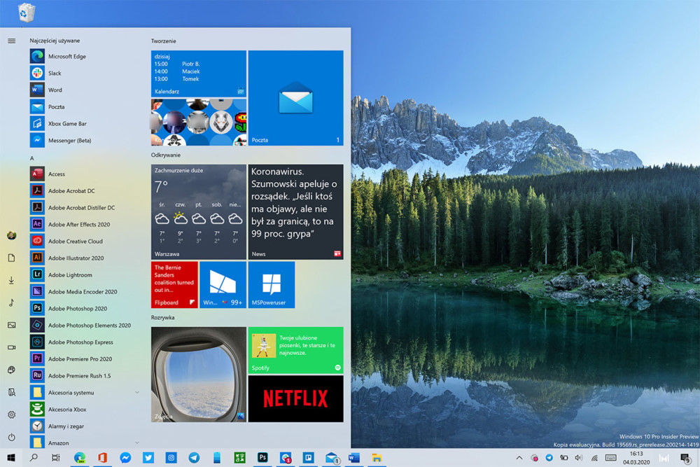
As a result, my pinned tiles look like the screenshot above. Highly mixed colors, and I helped myself by choosing navy blue as the leading color of the system. If it were different, some of the active tiles would remain navy blue. Even Microsoft applications do not stick to the system leading color: for example those from Office or Microsoft Edge.
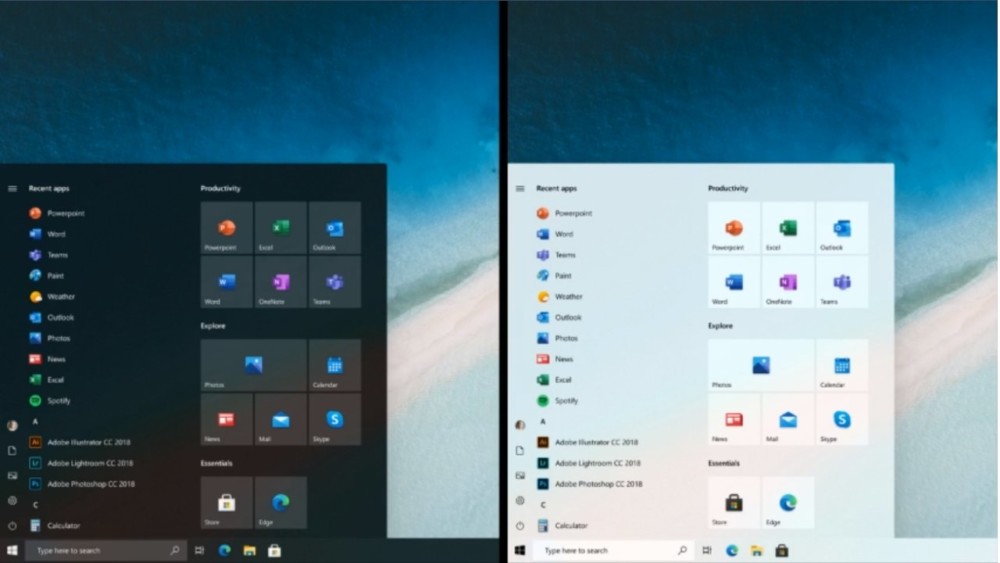
According to the new concept, all tiles would have a uniform background. Well eureka.
I have a lot of sarcasm and malice in me, because the problem of an incoherent background appeared with Windows Phone and Windows 8 - and so years ago - and still has not been solved. For the sake of justice, however, I would like to remind you that according to one of the first concepts, active tiles were not to allow application developers to modify the colors imposed by the system. However, this did not appeal to the developers of applications who wanted to display the colors identical to the given brand - for example, a characteristic shade of blue from Facebook.
Interestingly, active tiles will not go to Windows 10X, which is supposed to be a lightweight system for ultra-portable devices. So they will ironically remain used mainly on larger laptops and desktops, despite their mobile pedigree.
I have a weakness for them, despite their currently poor implementation. After all, we need to press the button to see them, which somewhat contradicts their idea, and thus providing a shortcut of information from the application immediately on the Desktop. However, this is the effect of vox populi , which prefers the classic and learned for decades idea of interface based on the icon grid, clearly more useful for most. However, I still use them because I still find the review of notifications in this form useful
It's good that they will be completely abandoned - although the Windows developers bending over this rather obvious problem after so many years is a bit frustrating.
Microsoft is taking over the appearance of the active Windows 10 tiles. It's fast


Comments
Post a Comment